I guess winter has arrived.

“Software developers have stopped caring about reliability”
This x1000. There’s been a shift in software dev away from reliability and usability. All of the incentives line up against them.
Remember this Chrome headless bug that I’ve been obsessing about?
Turns out that this is a known bug in Chrome headless on Linux. To fix it either turn off hinting or subpixel positioning
![]()
“Custom properties with defaults: 3+1 strategies – Lea Verou”
I don’t mind the verbose solution, personally, but these are all good tactics.
“Implementing form filling and accessibility in the Firefox PDF viewer – Attack & Defense”
PDF.js is an amazing library. I just wish it were better documented.
“The dark side of Eureka: Artificially induced Aha moments make facts feel true - ScienceDirect”
“Was it easier to build websites a decade ago? - Go Make Things”
Absolutely agree with this. The modern web is capable of amazing things. You don’t have to do it the hard way. (I mean, yeah you do if your boss is dead set on it, but you know what I mean)
“Every search bar looks like a URL bar to users – Terence Eden’s Blog”
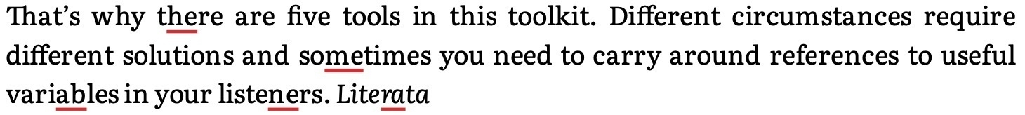
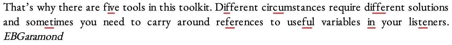
So, it looks like the kerning/spacing problems I saw in the PDF output of puppeteer/headless chrome on Linux wasn’t just an issue with a single font. Snaps from a test file: Literata, EB Garamond, and Inter

“CSS is Going Gosh-Darned Hog Wild, I Tell Ya What - CSS-Tricks”
CSS is easily my favourite part of the web stack.
“Appwalls and their apps are destructive to the open web. - Airbag Industries”
So, it turns out that the typographic quality of Chrome’s PDF output varies quite a bit OS to OS.
Subjective assessment:
- macOS: really good
- Windows: not bad, though not as good as macOS
- Desktop Linux: same to marginally worse than Windows
- Headless Linux: quite bad.
As always, I am a goddamn bug magnet. Not only have I run into a known Chrome bug in my PDF testing (no hyphenation on linux when headless/puppeteer) but I seem to have discovered a ligature bug in weasyprint. Justifying text with a custom font seems to disable ligatures.
“About TypeScript Hype. Are you happy about TS? Good, really…”
TS is a very useful JS superset. Its fanbase, however, is extremely annoying, even tho it feels a bit like they’ve toned it down a bit of late. Maybe that’s just the folks I follow, tho.
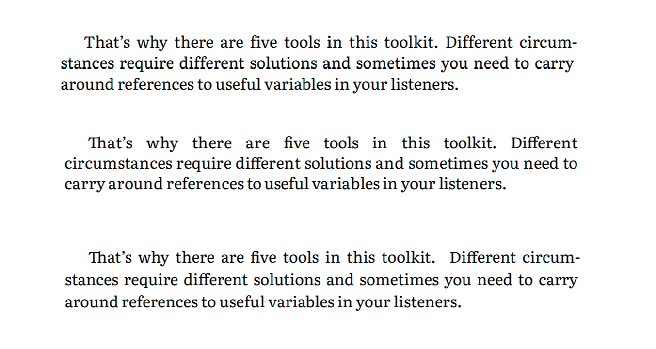
Working on a series of reviews of various free/OSS tools for generating print-ready PDFs from HTML and CSS. First up is will be weasyprint. Can you guess which of these is which: latex, weasyprint, and Chrome/puppeteer?
People with smarphones: use all sorts of fancy software and machine learning to fake a shallow DoF.
Me with an expensive camera: deep focus everywhere! Sharp!
Also met one of the friendly neighbourhood cats 
Walk around the neighbourhood 3: not the only person on an autumn walk